QGIS for Economic Research
A short, hands-on course for economics students: from installing the software to your first map and your first spatially derived dataset. No coding required.
Economists increasingly work with data that have a location: regions, cities, firms, households, satellite pixels. A Geographic Information System (GIS) is the tool that lets you combine such data, measure things about them, and map them. This course introduces QGIS, a free and open-source GIS, through two complete tasks that mirror what applied researchers actually do: joining a statistical table to a set of regional boundaries to produce a publication-quality map, and summarizing a satellite raster (nighttime lights) by region to build a new variable that you can export and use in Stata, R, or Excel. Everything is done by pointing and clicking in QGIS; every file used is open data.
1 Introduction
What a GIS is, in one paragraph
If you have used Excel, Stata, or R, you already know what a data table looks like: one row per observation, one column per variable. A GIS uses the same tables with one addition: every row also has a shape, a location on the Earth’s surface. A row can be a point (a firm, a school, a conflict event), a line (a road, a river, a railway), or a polygon (a municipality, a region, a country). Rather than being an extra column, the shape is what allows the software to draw the row on a map, and, more importantly, to compute with it: how large is this region, how far is this village from the nearest city, how many people live within 10 km of this port, what is the average rainfall inside this district.
The link between the “ordinary” statistical world and the spatial world is usually an identifier. In Europe it is the NUTS code (ITC4 is Lombardy); in the United States it is the FIPS or GEOID code; across countries it is the ISO code (ITA). If your regression dataset has that code and a boundary file has the same code, the two can be joined, and a spreadsheet of numbers becomes a map, or a map becomes new columns in your spreadsheet. Much of this course is about making that bridge work.
Why economists should care
Without GIS, the units of analysis available to an economist are those for which someone else has already published statistics: countries, and administrative regions in the countries that report them. With GIS, the unit of analysis can be anything you can draw: a grid cell, a 50 km circle around a mine, the historical homeland of an ethnic group, the catchment area of a railway station (Chiovelli and Hohmann 2020). Three uses come up again and again in applied work.
Measurement. Satellite imagery makes it possible to measure economic activity where official statistics are poor or missing. The best-known example is Henderson et al. (2012), who show that nighttime light intensity tracks GDP and use it to correct growth figures for countries with weak statistical systems. The same data have since been used to study subnational development in Africa (Michalopoulos and Papaioannou 2014), regional favoritism by political leaders (Hodler and Raschky 2014), and deforestation as a response to local political incentives (Burgess et al. 2012). You will build this kind of variable yourself in Section 4.
Merging covariates. Almost any geographic characteristic can be attached to your units of observation: terrain ruggedness (Nunn and Puga 2012), soil suitability, rainfall, distance to the coast or to a market, elevation. These are the “geographic controls” that appear in a large share of empirical papers, and they are all produced with the operations you will learn here (join, clip, zonal statistics).
Identification. Spatial data support credible research designs. Dell (2010) compares households on either side of the boundary of Peru’s colonial mita system, a spatial regression discontinuity. Nunn (2008) digitizes historical maps of ethnic groups to build measures of slave exports and, together with distances computed in GIS, an instrument for them. Duflo and Pande (2007) use river gradient, a purely topographic variable, as an instrument for dam construction. Donaldson and Hornbeck (2016) reconstruct the historical railway network to compute “market access” for every county in the United States. None of these papers would exist without a GIS.
The common thread is simple: geography is data, and a GIS is the tool for turning it into variables.
Who this course is for
This course is written for undergraduate and master’s students in economics who have never opened a GIS program. It assumes no knowledge of geography and no programming. The only software used is the QGIS desktop application; no R, Python, or Stata is needed to complete the tasks (although you will want one of them to analyze the tables you produce at the end).
Two things this course deliberately does not do. It does not try to be a complete QGIS manual; the official documentation (QGIS Development Team 2024) does that well. And it does not cover scripting. Once you find yourself repeating the same clicks for the twentieth time, it is time to automate, and the sources listed at the end are the natural next step (Chiovelli and Hohmann 2020; Economic Growth and Comparative Development, n.d.).
Installing QGIS
QGIS is free, open source, and available for Windows, macOS, and Linux. Download it from qgis.org/download.
- On the download page you will see two versions: a Long Term Release (LTR) and a Latest Release. Choose the LTR. It receives bug fixes for a year, changes less often, and is the version most tutorials, including this one, are written against. The screenshots in this course come from QGIS 3.34 LTR on macOS; menus and dialogs look the same on Windows, and QGIS 4 keeps the same layout with minor cosmetic changes.
- Windows: download the standalone installer (
.msi), run it, and accept the defaults. You do not need the optional sample datasets. - macOS: download the
.dmg, open it, and drag QGIS to your Applications folder. The first time you open it, macOS may warn that the application was downloaded from the internet; click Open. If macOS refuses to open it at all, right-click (or control-click) the app icon, choose Open, and confirm. Official installers are signed and notarized, so this should not happen with a recent release. - Linux: follow the distribution-specific instructions on the download page (on Ubuntu and Debian it is a matter of adding the QGIS repository and running
apt install qgis).
The first launch takes a little longer than usual because QGIS builds its list of tools. When the window appears, you are ready.
ArcGIS is the commercial standard, and if your department has a license it is a fine tool. QGIS does everything this course needs, runs on any operating system, costs nothing, and is what most of the research community outside the United States now uses. Skills transfer easily: the concepts (layers, projections, joins, zonal statistics) are identical (Economic Growth and Comparative Development, n.d.).
2 The basics
Two kinds of spatial data
All the files you will meet fall into two families (Chiovelli and Hohmann 2020).
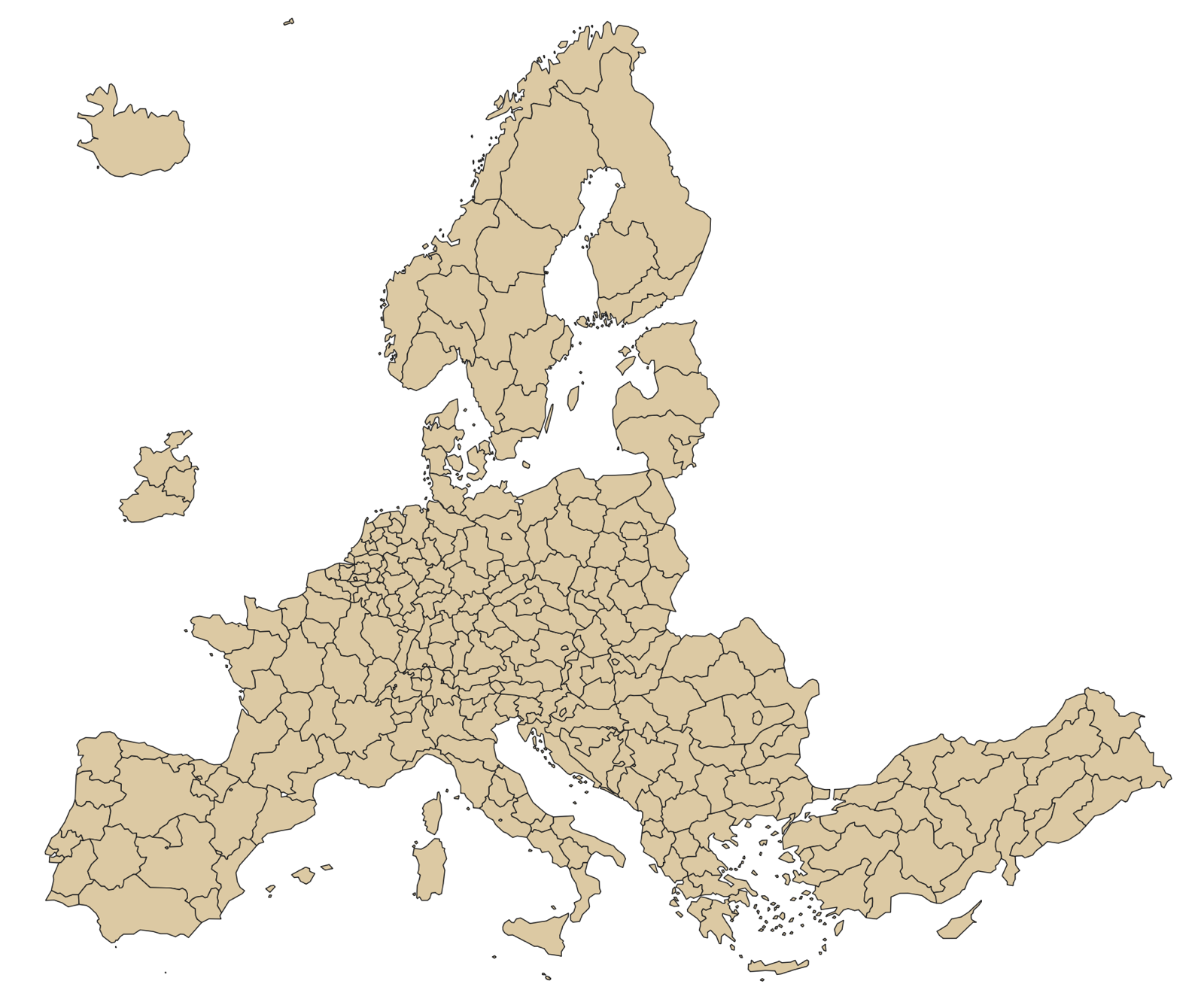
Vector data represent discrete objects as geometry: points, lines, or polygons. Each object (a feature) has a row in an attribute table. A file of European regions is a set of polygons whose attribute table has one row per region with its code and name. When you look at the map you see the polygons; when you open the attribute table you see the rows. They are the same thing.
Raster data represent a continuous surface as a grid of cells, like a photograph. Each cell holds one number: elevation, temperature, population density, or, as in this course, the intensity of light emitted at night. There is no attribute table; the data are the numbers in the grid. The size of a cell (its resolution) determines how much detail the raster contains. The nighttime lights raster you will use has cells of 30 arc-seconds, roughly 1 km at the equator.
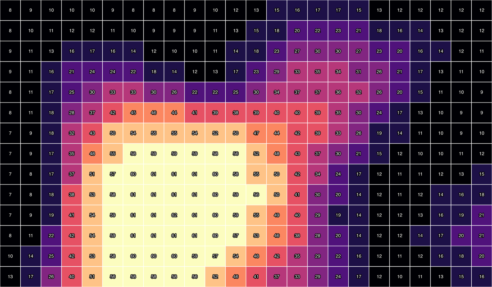
The two families are combined constantly. In Section 4 you will take a raster (lights) and a set of polygons (regions) and compute, for each polygon, the average of the cells it contains. That operation, zonal statistics, is the workhorse of applied spatial economics.
File formats you will meet
| Format | Extension | What it holds | Notes |
|---|---|---|---|
| Shapefile | .shp + .shx + .dbf + .prj (+ .cpg) |
Vector | The oldest and most common format. It is a bundle of files: the .shp stores the geometry, the .dbf the attribute table, the .prj the coordinate system. Always keep them together in the same folder, and zip them together when sharing. |
| GeoPackage | .gpkg |
Vector (and raster) | A modern single-file format built on SQLite. Can hold several layers, has no limits on field names, and is the format QGIS uses by default when saving. Use it for everything you create yourself. |
| GeoJSON | .geojson |
Vector | A plain-text format common on the web. Fine for small files. |
| CSV | .csv |
Table, or points | A statistical table with no geometry, or a table of points if it has latitude and longitude columns. This is how your Stata or R data enter QGIS. |
| GeoTIFF | .tif |
Raster | An image file with georeferencing information embedded. The standard for satellite-derived data. |
| QGIS project | .qgz |
Neither | A project file stores which layers are open, how they are styled, and how the map is laid out; it does not contain the data. If you move or rename the data files, the project will not find them. |
Two habits will save you hours. First, never rename or move a single component of a shapefile. Second, keep a project folder with a fixed structure (see below) and save the QGIS project inside it, so that QGIS records the data paths relative to the project and the whole folder can be copied to another computer.
Coordinate reference systems, briefly
Every spatial file comes with a coordinate reference system (CRS) that says what its coordinates mean. There are two types (Chiovelli and Hohmann 2020).
- A geographic CRS locates points on the sphere with latitude and longitude in degrees. The universal one is WGS 84, with the code
EPSG:4326. Almost all downloadable data, including everything in this course, come in WGS 84. It is the right system for storing and exchanging data. - A projected CRS flattens the sphere onto a plane and measures coordinates in meters. Every projection distorts something: shape, area, distance, or direction. A projection that preserves area (an equal-area projection) is the one to use whenever you compute areas, densities, or sums over cells, because in WGS 84 a “degree” is 111 km at the equator and 56 km at 60° north, so cells of equal size in degrees are not of equal size on the ground. For Europe, the standard equal-area projection is ETRS89-LAEA, code
EPSG:3035, which is what Eurostat uses for its maps and what all the maps in this course use. For a single country or a small region, the local UTM zone is the usual choice. For the whole world, Mollweide or a cylindrical equal-area projection (Economic Growth and Comparative Development, n.d.).
QGIS handles the practical side gracefully: every layer keeps its own CRS, and the project has a CRS used for display. When they differ, QGIS reprojects layers on the fly for drawing. This is fine for looking at maps. For computing (areas, distances, sums), the safe practice is to reproject the data themselves to an equal-area or local projected system first, using Layer ▸ Export ▸ Save Features As… for vectors or Raster ▸ Projections ▸ Warp (Reproject)… for rasters.
Store and share data in WGS 84 (EPSG:4326). Compute areas, densities, and sums in an equal-area projection (EPSG:3035 for Europe). Check the CRS of a layer with Layer Properties ▸ Information; check the project CRS in the bottom-right corner of the QGIS window.
The QGIS window
Open QGIS. The window has five parts you will use all the time.
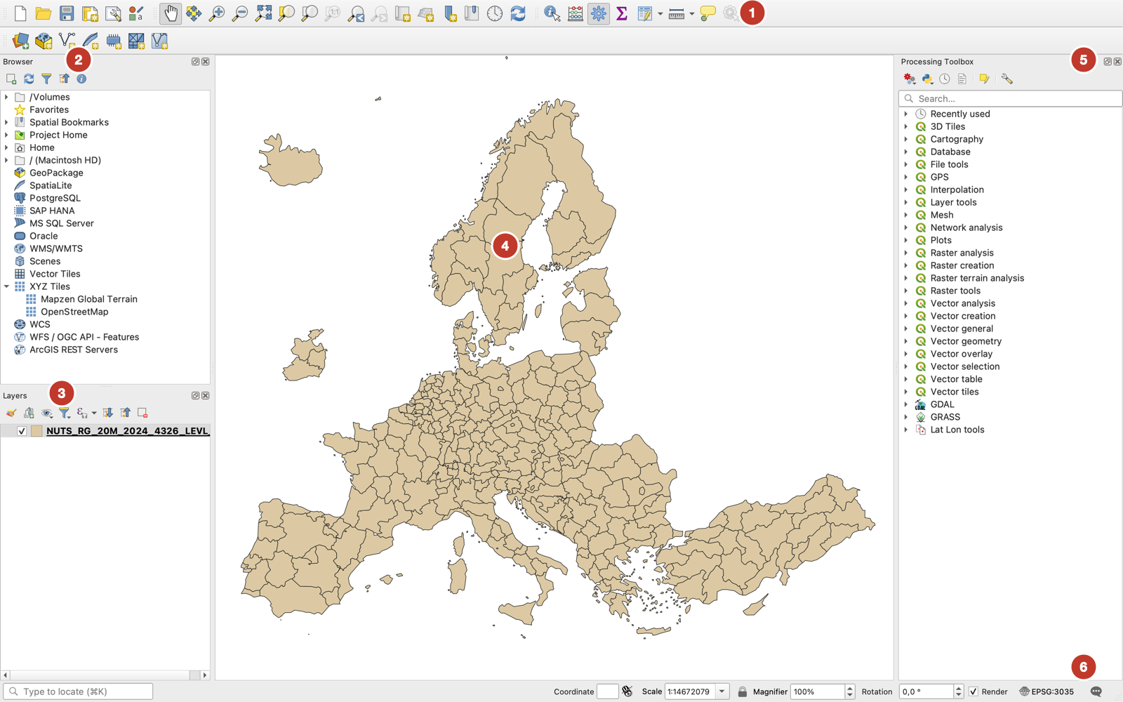
- Toolbars hold the buttons for the most common actions: open and save projects, add layers, pan and zoom, identify a feature, select features, open the attribute table.
- The Browser panel is a file explorer restricted to spatial data. It shows a shapefile as a single item rather than five files, which is convenient. Right-click a folder and choose Add as a Favorite to keep your project folder one click away.
- The Layers panel lists the layers in the project, in drawing order: layers at the top are drawn over layers below. Uncheck a layer to hide it; drag it to change the order; double-click it to open its properties.
- The map canvas draws the checked layers in the project CRS.
- The Processing Toolbox contains several hundred analysis tools (buffers, joins, zonal statistics, clipping, reprojection). It has a search box; you will use it in Section 4. If it is not visible, open it with Processing ▸ Toolbox or Ctrl-Alt-TCtrl-Alt-T.
- The status bar shows the coordinates under the cursor, the map scale, and the project CRS (
EPSG:3035in the screenshot). Click the CRS code to change the project CRS.
Panels can be shown or hidden from View ▸ Panels. The layout shown above (Browser and Layers on the left, Toolbox on the right) is a good default for research work (Chiovelli and Hohmann 2020).
Setting up a project
Before downloading anything, create a folder for the course with three subfolders. This structure is used throughout the text.
qgis-course/
├── data/        ← files you download (never edit these)
├── outputs/     ← files QGIS creates for you
└── course.qgz   ← the QGIS project file
Then, in QGIS:
- Project ▸ New opens an empty project.
- Project ▸ Properties… ▸ CRS. Type
3035in the filter box, select ETRS89-extended / LAEA Europe (EPSG:3035), and click OK. Europe will now be drawn without the stretching that WGS 84 produces at high latitudes. - Project ▸ Save As…. Save the project as
course.qgzinsideqgis-course/. Save often (Ctrl-SCtrl-S); QGIS does not autosave. - In the Browser panel, navigate to
qgis-course/, right-click it, and choose Add as a Favorite.
Loading data
There are three equivalent ways to load a file, and you will end up using all of them.
- Drag and drop from the Browser panel (or from your operating system’s file manager) onto the map canvas or the Layers panel. Fastest.
- The Layer menu. Layer ▸ Add Layer ▸ Add Vector Layer… for shapefiles and GeoPackages, Add Raster Layer… for GeoTIFFs, Add Delimited Text Layer… for CSV files. Each opens the Data Source Manager on the relevant tab.
- The Data Source Manager directly (Ctrl-LCtrl-L), which has one tab per data type.
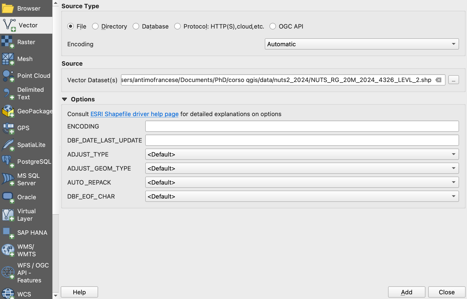
.shp file of the bundle and click Add.
Looking at what you loaded
Four tools tell you what a layer contains.
- Zoom to layer. Right-click the layer in the Layers panel and choose Zoom to Layer(s). Use the mouse wheel to zoom and hold the wheel (or use the hand tool) to pan.
- The attribute table. Right-click the layer and choose Open Attribute Table (F6F6). One row per feature; click a row number to select that feature, and it is highlighted on the map. The top-left toolbar of the table has a Select by expression button (the ε icon), where you can type conditions such as
"CNTR_CODE" = 'IT'to select all Italian regions. Field names go in double quotes, text values in single quotes. - Identify Features (the ⓘ button on the toolbar). Click a polygon or a raster cell on the map and a panel shows its attributes or its value.
- Layer Properties (double-click the layer). The Information tab reports the CRS, the extent, the number of features, and the field names and types; the Source tab lets you change the CRS if a file came without one.
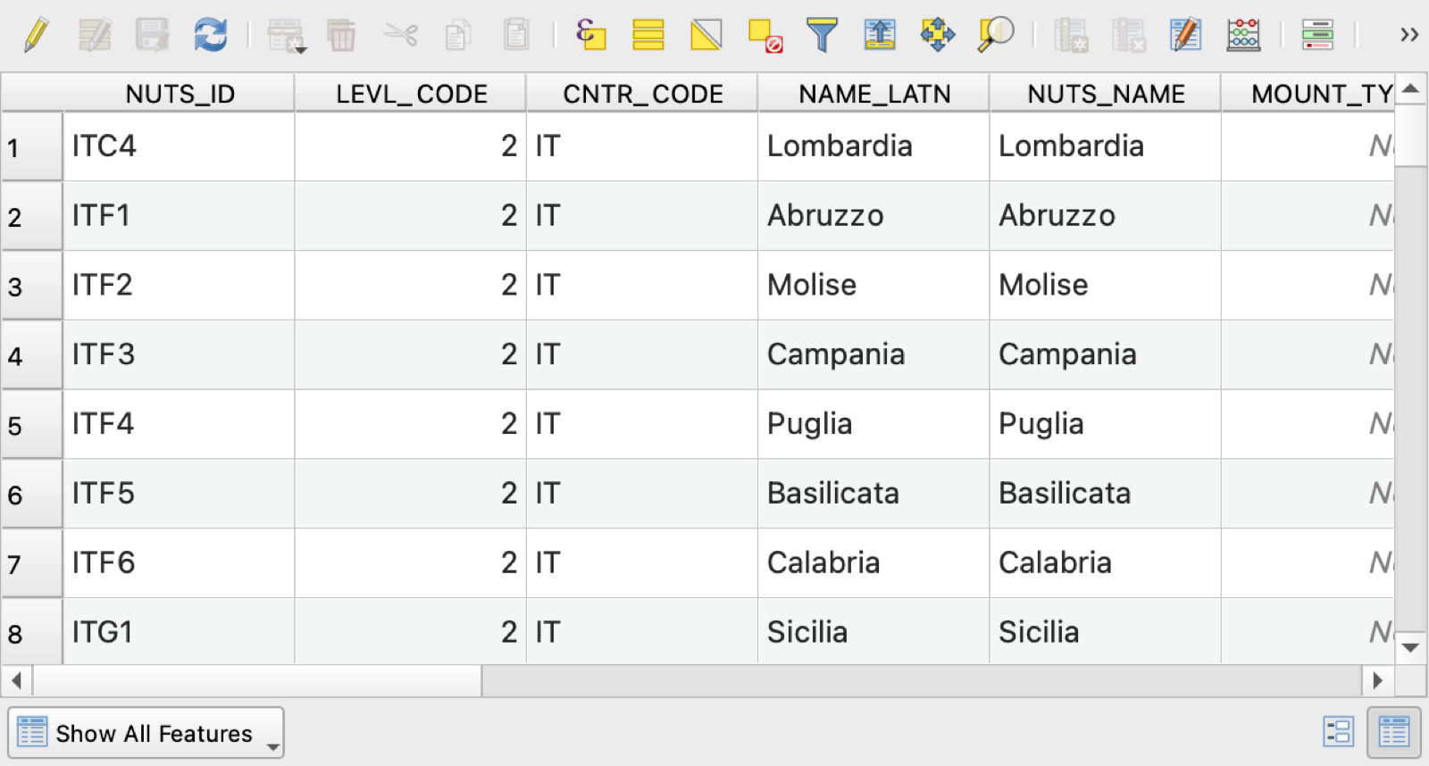
NUTS_ID is the code that will be used to join statistical data.
3 Task 1 — From a statistical table to a map
The first task is the one every applied researcher does sooner or later: take a table of regional statistics, attach it to the boundaries of the regions, draw a choropleth map, and export both the map and the merged table. We will map GDP per capita across the NUTS-2 regions of Europe in 2023.
The data
You need two files.
Boundaries. Eurostat’s GISCO service publishes the NUTS regions as shapefiles at several scales. Download the NUTS-2 level, 2024 version, scale 1:20 million, in WGS 84:
NUTS_RG_20M_2024_4326_LEVL_2.shp.zip (about 160 KB, from the GISCO NUTS page)
Unzip it into data/nuts2_2024/. You will see five files with the same name and different extensions; they are one shapefile. The 1:20M scale is deliberately coarse (boundaries are simplified for drawing whole continents); if you ever zoom into a single country, download the 1:3M or 1:1M version instead. The file name encodes all of this: RG (regions, i.e., polygons), 20M (scale), 2024 (NUTS version), 4326 (CRS), LEVL_2 (NUTS level).
Statistics. Eurostat’s regional GDP table is nama_10r_2gdp. Rather than navigating the data browser, download a filtered CSV directly from Eurostat’s API by opening this address in your browser (it is one line; your browser will download a file):
https://ec.europa.eu/eurostat/api/dissemination/sdmx/2.1/data/nama_10r_2gdp/A.PPS_EU27_2020_HAB.?format=SDMX-CSV&startPeriod=2023&endPeriod=2023
Save it as data/eurostat_gdp_pps_nuts2_2023.csv. The address asks for annual data (A), in purchasing power standard per inhabitant (PPS_EU27_2020_HAB), for 2023. The same table can be reached through the Eurostat data browser by filtering the unit and time dimensions and clicking Download. Open the CSV in a text editor to see its structure:
DATAFLOW,LAST UPDATE,freq,unit,geo,TIME_PERIOD,OBS_VALUE,OBS_FLAG,CONF_STATUS
ESTAT:NAMA_10R_2GDP(1.0),10/02/26 11:00:00,A,PPS_EU27_2020_HAB,AT,2023,46400,,
ESTAT:NAMA_10R_2GDP(1.0),10/02/26 11:00:00,A,PPS_EU27_2020_HAB,AT1,2023,45400,,
ESTAT:NAMA_10R_2GDP(1.0),10/02/26 11:00:00,A,PPS_EU27_2020_HAB,AT11,2023,33200,,
Two columns matter: geo holds the NUTS code and OBS_VALUE the value. Notice that the file mixes levels: AT is the country, AT1 a NUTS-1 region, AT11 a NUTS-2 region. The join will simply ignore rows whose code has no matching polygon, so there is no need to clean the file first.
Both files, exactly as used in this course, are also available in the Files section, in case the links above change.
Step 1: Load the boundaries
- Drag
NUTS_RG_20M_2024_4326_LEVL_2.shpfrom the Browser panel onto the map, or use Layer ▸ Add Layer ▸ Add Vector Layer… (Figure 4). The layer appears in the Layers panel with a random fill color. - Right-click the layer and Zoom to Layer. Europe looks small: the file includes the outermost regions of the European Union (French Guiana, Réunion, the Canary Islands, the Azores), so the full extent spans from South America to the Indian Ocean. Zoom in on the continent with the mouse wheel.
- Open the attribute table (F6F6) and find the
NUTS_IDcolumn (Figure 5). This is the key that will connect the polygons to the statistics.
Step 2: Load the table
A CSV without coordinates is loaded as a table layer: it has rows and columns but no geometry, so it draws nothing on the map.
- Layer ▸ Add Layer ▸ Add Delimited Text Layer….
- Under File name, browse to
data/eurostat_gdp_pps_nuts2_2023.csv. QGIS reads the file and fills the Sample Data preview at the bottom. - Under File Format, CSV (comma separated values) should be selected automatically.
- Expand Geometry Definition and choose No geometry (attribute only table). This is the step people forget; without it QGIS waits for you to name latitude and longitude columns.
- In the sample preview, check the type detected for each column.
OBS_VALUEmust show a number icon (Integer or Decimal), not Text. If it shows Text, expand Record and Fields Options and make sure Detect field types is checked. - Click Add, then Close. The table appears in the Layers panel with a table icon.
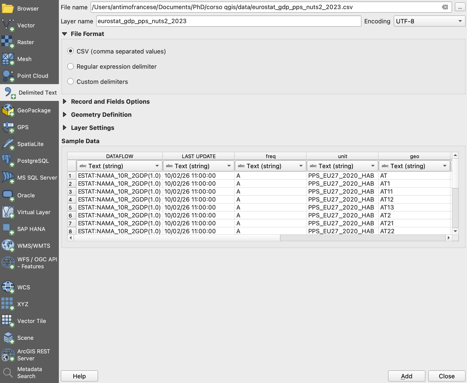
geo is text and OBS_VALUE is an integer.
Step 3: Join the table to the polygons
A join attaches the columns of the table to the rows of the polygon layer, matching on a key. In QGIS, joins are defined in the properties of the polygon layer (the target).
- Double-click the NUTS-2 layer to open Layer Properties and select the Joins tab.
- Click the green + button at the bottom. The Add Vector Join dialog opens (Figure 7).
- Join layer:
eurostat_gdp_pps_nuts2_2023. Join field:geo(the code in the table). Target field:NUTS_ID(the code in the polygon layer). - Leave Cache join layer in memory checked. Expand Custom field name prefix and type
gdp_; otherwise the new columns will be prefixed with the full name of the CSV, which is unwieldy. - Click OK twice.
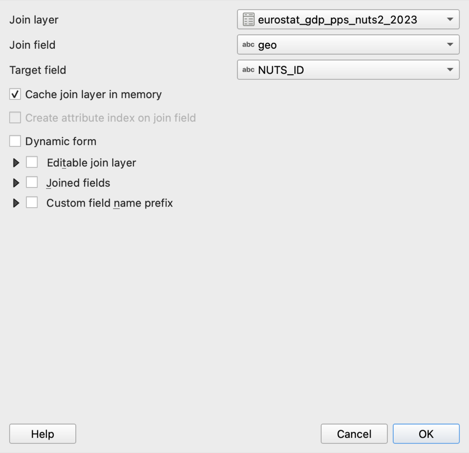
geo column of the table to the NUTS_ID column of the polygons.
Open the attribute table again. It now has extra columns at the right: gdp_TIME_PERIOD, gdp_OBS_VALUE, and so on. Scroll down and you will find regions where these columns are NULL: Switzerland, Norway, Iceland, the Western Balkans, whose polygons are in the GISCO file but whose GDP is not in this Eurostat table. In our data, 276 of the 299 polygons find a match. Unmatched rows are normal; the important check is that the regions you expect to match do. If nothing matches, the usual culprit is a mismatch in the codes (extra spaces, lowercase, a different NUTS version).
Step 4: Make the join permanent
A join is virtual: it exists only inside the project, and the joined columns cannot be edited or used by some tools. Save the result as a new layer before going further, keeping only the columns you need.
- Right-click the NUTS-2 layer and choose Export ▸ Save Features As….
- Format: GeoPackage. File name:
outputs/nuts2_gdp_2023.gpkg. Layer name:nuts2_gdp_2023. Leave the CRS asEPSG:4326. - Expand Select fields to export and their export options and keep only
NUTS_ID,CNTR_CODE,NAME_LATN, andgdp_OBS_VALUE(click Deselect All first, then tick these four). - Make sure Add saved file to map is checked and click OK.
The new layer nuts2_gdp_2023 is a normal, self-contained file. You can now remove the original shapefile and the CSV from the project (right-click, Remove Layer) to keep things tidy, or keep them and uncheck them. If you want a friendlier column name, open the new layer’s properties, go to Fields, click the pencil to toggle editing, double-click the name gdp_OBS_VALUE, rename it gdp_pps_2023, and click the pencil again to save. The figures below use that name.
Step 5: Style the map
A choropleth map colors each polygon according to a variable. In QGIS this is the Graduated renderer.
- Double-click
nuts2_gdp_2023and open the Symbology tab. - In the drop-down at the top, change Single Symbol to Graduated.
- Value:
gdp_pps_2023(orgdp_OBS_VALUEif you did not rename it). - Color ramp: choose a sequential ramp. Viridis is a good default: it is perceptually uniform (equal steps in the data look like equal steps in color) and readable by people with color-vision deficiencies. Avoid rainbow ramps.
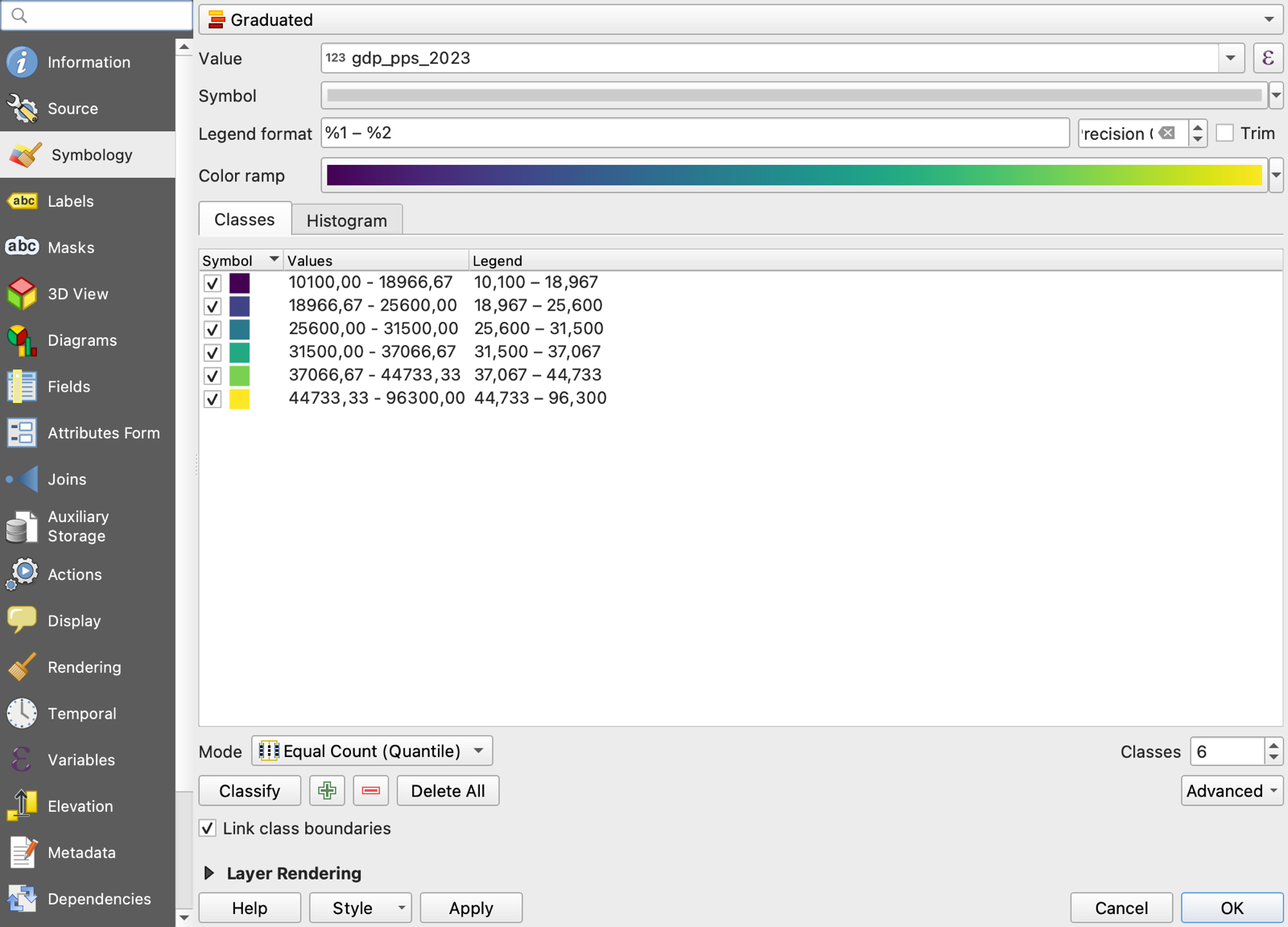
- Mode: Equal Count (Quantile). Classes: 6. Click Classify. Six classes with their ranges appear (Figure 8).
- Legend format:
%1 – %2, Precision: 0, so that the legend reads “18,967 – 25,600” rather than showing decimals. - Optionally, click the Symbol button and set the stroke (outline) color to white and its width to 0.1 mm, which makes small regions easier to see.
- Click Apply to preview and OK to close.
The same data can tell different stories depending on how the classes are cut. Equal Interval divides the range of values into equal-width bins, which for a skewed variable like GDP per capita (Luxembourg, Dublin, and Brussels are far above everyone else) puts most regions in the lowest class and shows little variation. Quantile puts the same number of regions in each class, which always shows variation but hides how unequal the classes are. Natural Breaks (Jenks) looks for gaps in the distribution. There is no correct choice; there is only a choice you can defend, and it belongs in the map’s caption. Try the three modes and look at the histogram tab.
Regions with no data (NULL) are not drawn by the Graduated renderer, so they appear as holes. A clean solution is to keep a second copy of the boundaries underneath, styled with a light gray fill and labeled “No data” in the legend; the maps in this course do exactly that.
Step 6: Compose and export the map
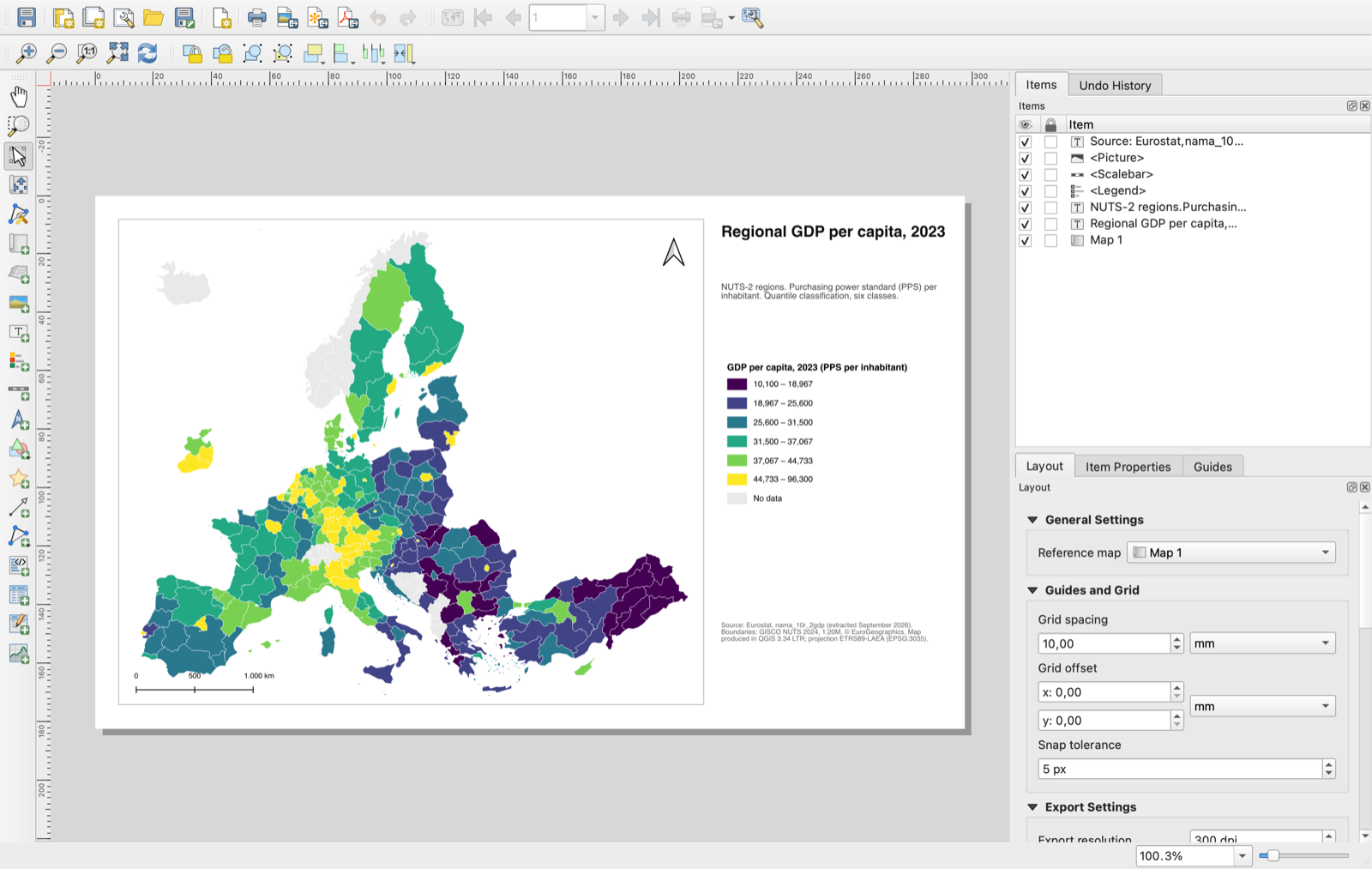
The map canvas is for exploring. A map for a paper or a presentation is built in the Print Layout, which adds a title, a legend, a scale bar, and a source note, and exports at a chosen resolution.
- Project ▸ New Print Layout…. Give it a name (“GDP map”). A blank page opens in a separate window (Figure 9).
- Layout ▸ Page Properties (or right-click the page) to set the size and orientation, for example A4 landscape.
- Add the map: Add Item ▸ Add Map, then drag a rectangle on the page. The map shows the current canvas. In Item Properties on the right you can set the scale, or click Set to map canvas extent. Use the Move item content tool (the hand with arrows) to pan inside the frame.
- Add a legend: Add Item ▸ Add Legend, drag a rectangle. In Item Properties, uncheck Auto update and remove layers you do not want listed; double-click a layer name to give it a readable title such as “GDP per capita, 2023 (PPS)”.
- Add a scale bar: Add Item ▸ Add Scale Bar. Set units to kilometers.
- Add a north arrow: Add Item ▸ Add North Arrow.
- Add text: Add Item ▸ Add Label for the title and, in a smaller font at the bottom, the source note. A map without a source note is not finished. The note should say what the data are, where they come from, and which projection is used.
- Export: Layout ▸ Export as Image… (PNG at 300 dpi for slides and web), Export as PDF… (for papers), or Export as SVG… (if you want to edit the map in a vector graphics program).
The result is a map you could put in a paper.
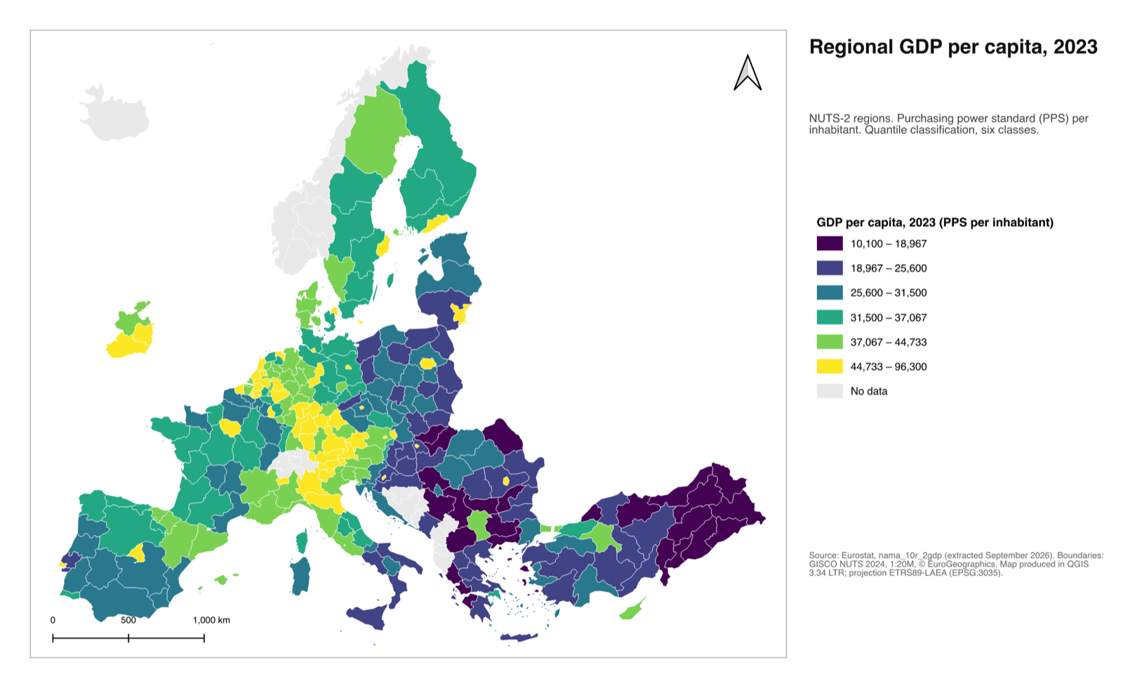
nama_10r_2gdp; boundaries: GISCO NUTS 2024 (© EuroGeographics). Made in QGIS 3.34 LTR, projection ETRS89-LAEA.
Step 7: Extract the table
The merged layer is also a dataset. To take it back to your statistical software, export the attribute table without the geometry.
- Right-click
nuts2_gdp_2023and choose Export ▸ Save Features As…. - Format: Comma Separated Value [CSV]. File name:
outputs/nuts2_gdp_2023.csv. - Under Layer Options, leave GEOMETRY at its default, which drops the geometry. (Choosing AS_XY would add the coordinates of each polygon’s centroid as two extra columns, which is occasionally useful.)
- Click OK.
The file opens in Excel, Stata (import delimited), or R (read.csv) like any other CSV:
nuts2_gdp_2023.csv, the table exported at the end of Task 1.
| NUTS_ID | CNTR_CODE | NAME_LATN | gdp_pps_2023 |
|---|---|---|---|
| ITC4 | IT | Lombardia | 50,900 |
| ITF6 | IT | Calabria | 22,000 |
| DE21 | DE | Oberbayern | 66,600 |
| FR10 | FR | Ile-de-France | 61,500 |
| PL91 | PL | Warszawski stołeczny | 59,300 |
| BG31 | BG | Severozapaden | 16,200 |
| LU00 | LU | Luxembourg | 95,100 |
| CH01 | CH | Région lémanique | NULL |
This first task looks modest, but you have already done the two things that make GIS useful to an economist: you have moved data from a spreadsheet to a map, and from a map back to a spreadsheet.
4 Task 2 — From a raster to a table
The second task is the operation behind much of the “satellite data in economics” literature: take a raster and summarize it within polygons. We will compute, for every NUTS-2 region, the average intensity of nighttime lights in 2023, add it to the GDP table from Task 1, and export the result.
The data
Nighttime light images come from two generations of satellite sensors: DMSP-OLS (1992–2013) and VIIRS (2012–present). They are not directly comparable, so most researchers use a harmonized series. Li et al. (2020) produced one that is free, global, at 30 arc-second (~1 km) resolution, and updated annually; the 2024 update covers 1992–2024 (Li et al. 2025). Download the 2023 file:
Harmonized_DN_NTL_2023_simVIIRS.tif (31 MB, from the figshare dataset, license CC BY 4.0)
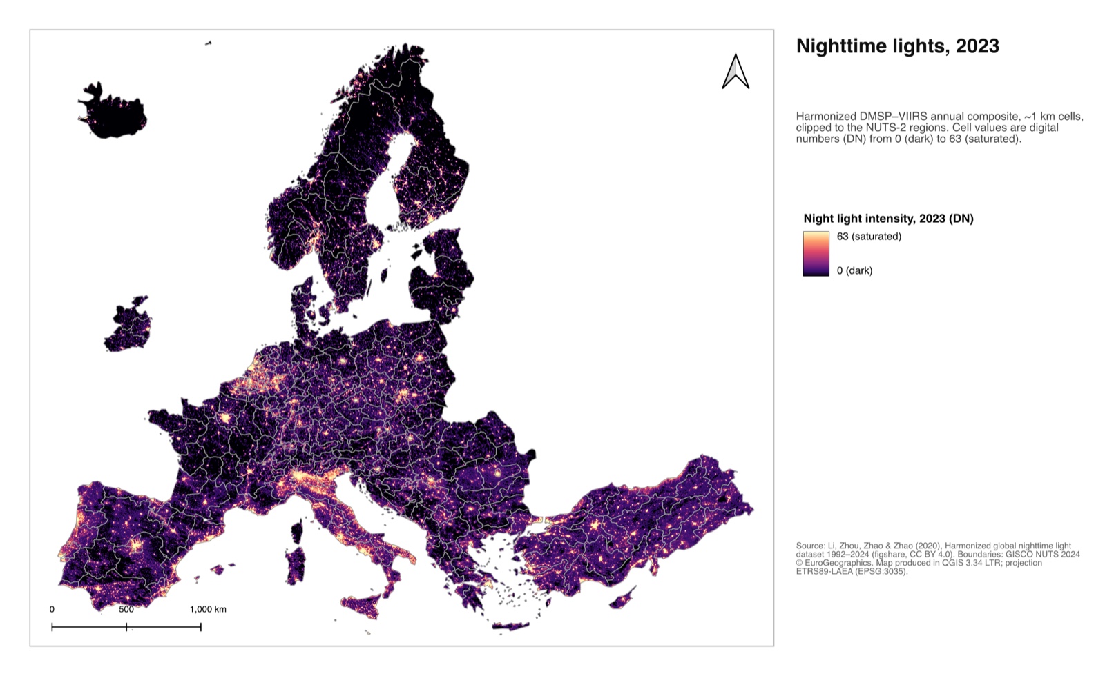
Save it in data/. Each cell holds a digital number (DN) from 0 (no detectable light) to 63 (saturated). The scale is the one of the older DMSP sensor, kept for comparability over time; the drawback is that city centers all saturate at 63, which flattens differences among the brightest places. Keep this in mind when interpreting the results.
Step 1: Load and inspect the raster
- Layer ▸ Add Layer ▸ Add Raster Layer…, select the
.tif, click Add. A gray-scale image of the world appears; it may take a few seconds to draw. - Double-click the layer and read the Information tab: 43,201 × 16,801 cells, one band, data type Int16, CRS
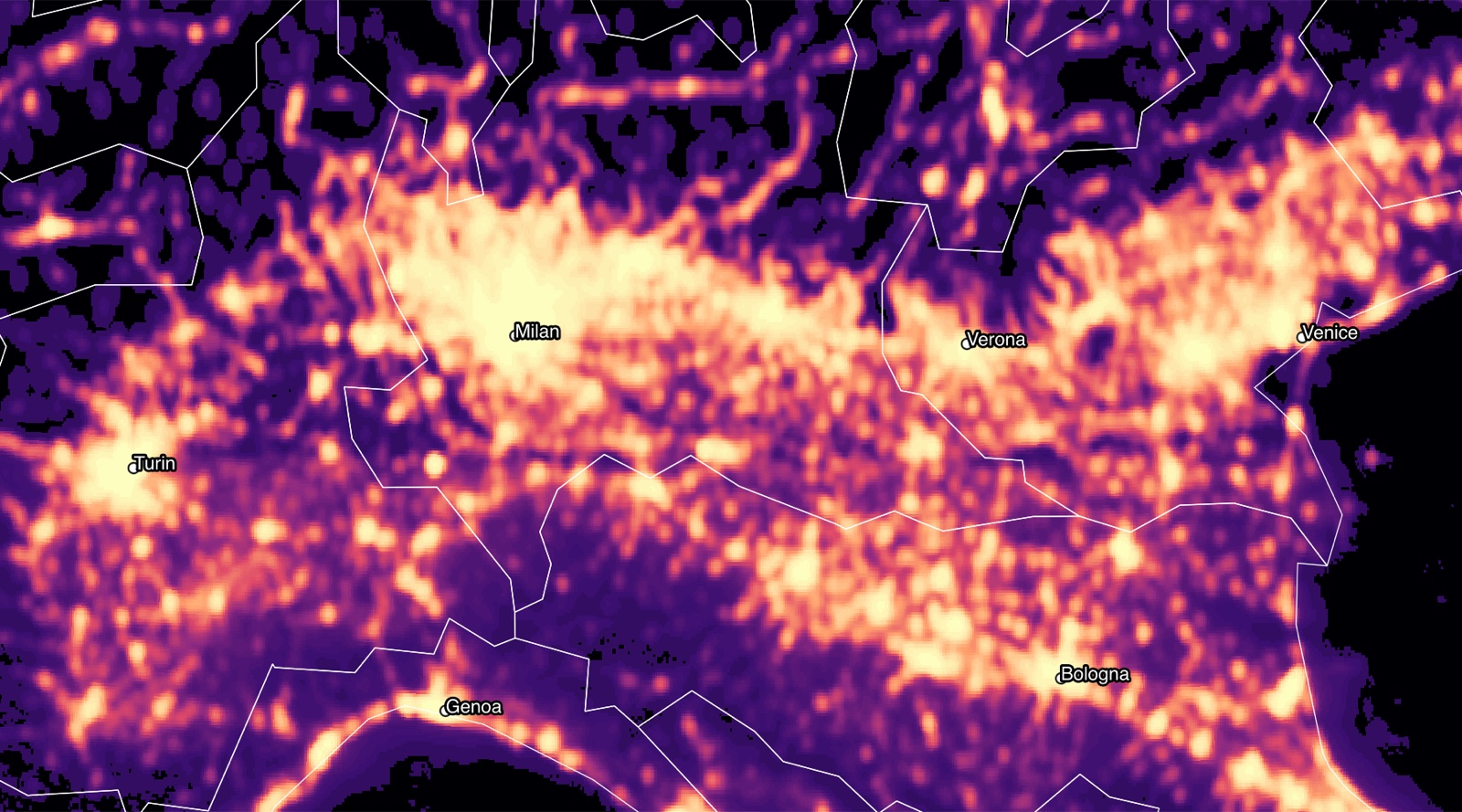
EPSG:4326, cell size 0.00833° (30 arc-seconds). The raster covers latitudes from 75° N to 65° S, which is why the northern tip of Norway is missing. - Zoom in on a city you know and use the Identify Features tool: clicking a cell reports its value. Zoom in far enough and the individual cells become visible, as in Figure 2.
Step 2: Style the raster
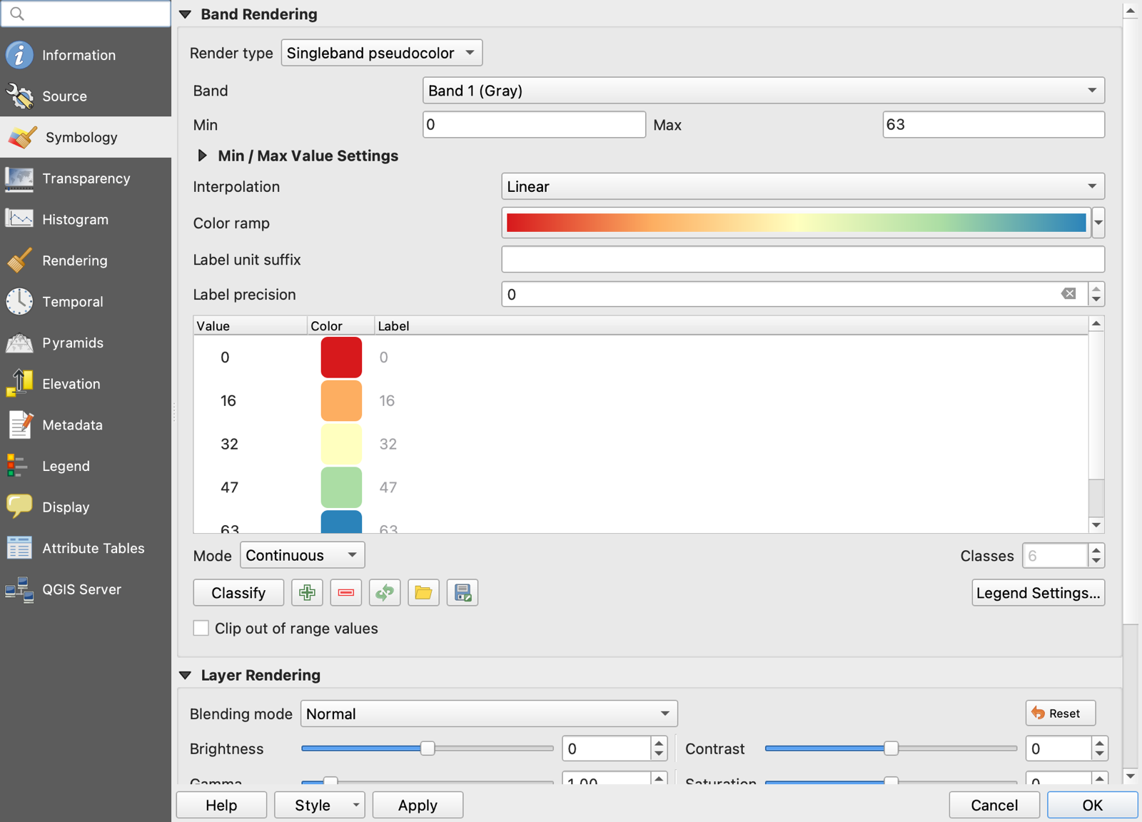
- Double-click the layer and open Symbology.
- Render type: Singleband pseudocolor. Min: 0, Max: 63. Color ramp: choose Magma or Inferno (dark for low values, bright for high), or any ramp you like. Interpolation: Linear.
- Click OK. Cities, highways, and the shape of settlement patterns emerge (Figure 12).
Step 3: Clip the raster to the study area
The raster covers the whole planet. Cutting it down to your regions makes every later step faster and produces a file you can share.
- Raster ▸ Extraction ▸ Clip Raster by Mask Layer….
- Input layer: the lights raster. Mask layer:
nuts2_gdp_2023(the GeoPackage from Task 1). Cells outside the polygons become “no data”. - Check Match the extent of the clipped raster to the extent of the mask layer and Keep resolution of input raster.
- Under Clipped (mask), click the … button, choose Save to File, and name it
outputs/ntl_2023_europe_clip.tif. Saving to a file rather than a temporary layer means you will not have to redo this when you reopen the project. - Click Run. It takes about a minute. Close the dialog when it finishes; the clipped raster is added to the map.
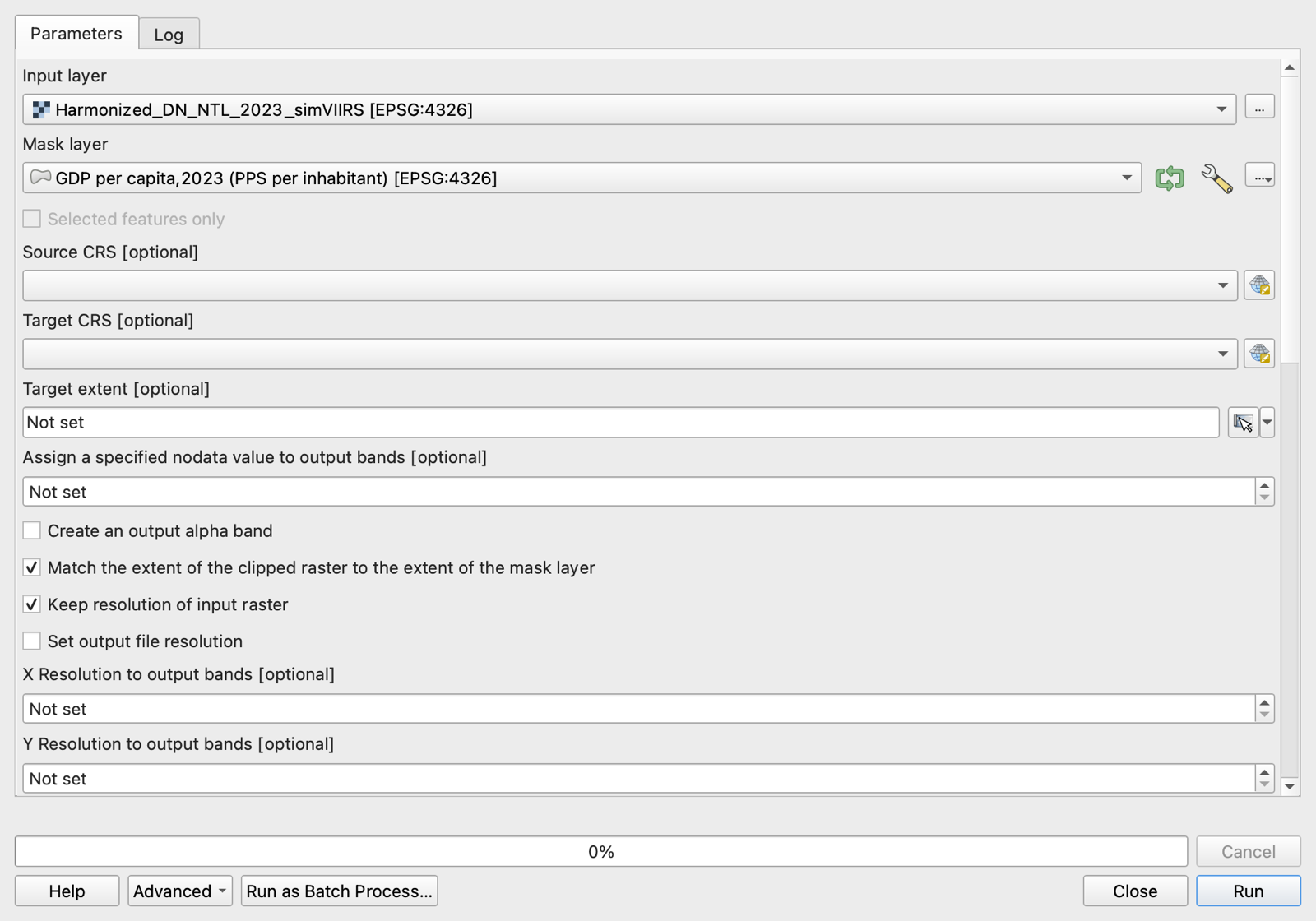
Because the mask includes the EU’s outermost regions, the clipped raster still spans a large box; the parts outside the polygons are empty and cost almost nothing on disk (the file is about 8 MB).
Step 4: Zonal statistics
Zonal statistics computes, for each polygon (the “zone”), summary statistics of the raster cells that fall inside it: how many cells, their sum, their mean, and so on. This is the step that turns pixels into a regional variable.
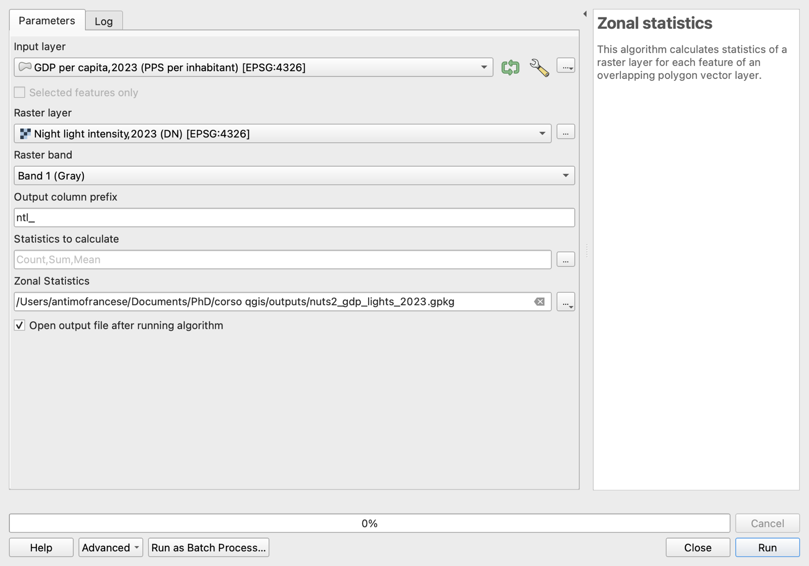
- Open the Processing Toolbox (Processing ▸ Toolbox) and type
zonalin its search box. Double-click Zonal statistics (under Raster analysis). - Input layer:
nuts2_gdp_2023. Raster layer:ntl_2023_europe_clip. Raster band: Band 1. - Output column prefix:
ntl_. - Statistics to calculate: click the … button and tick Count, Sum, and Mean.
- Under Zonal Statistics (the output), save to
outputs/nuts2_gdp_lights_2023.gpkg. - Click Run (Figure 15). A new layer appears with three extra columns:
ntl_count,ntl_sum,ntl_mean.
Open the attribute table of the new layer and sort by ntl_mean (click the column header). The brightest regions are small and entirely urban (Melilla, Budapest, Brussels, Prague); the darkest are the sparsely populated north and the outermost regions. Style the layer with the Graduated renderer on ntl_mean, as in Task 1, and you obtain a second map (Figure 16).
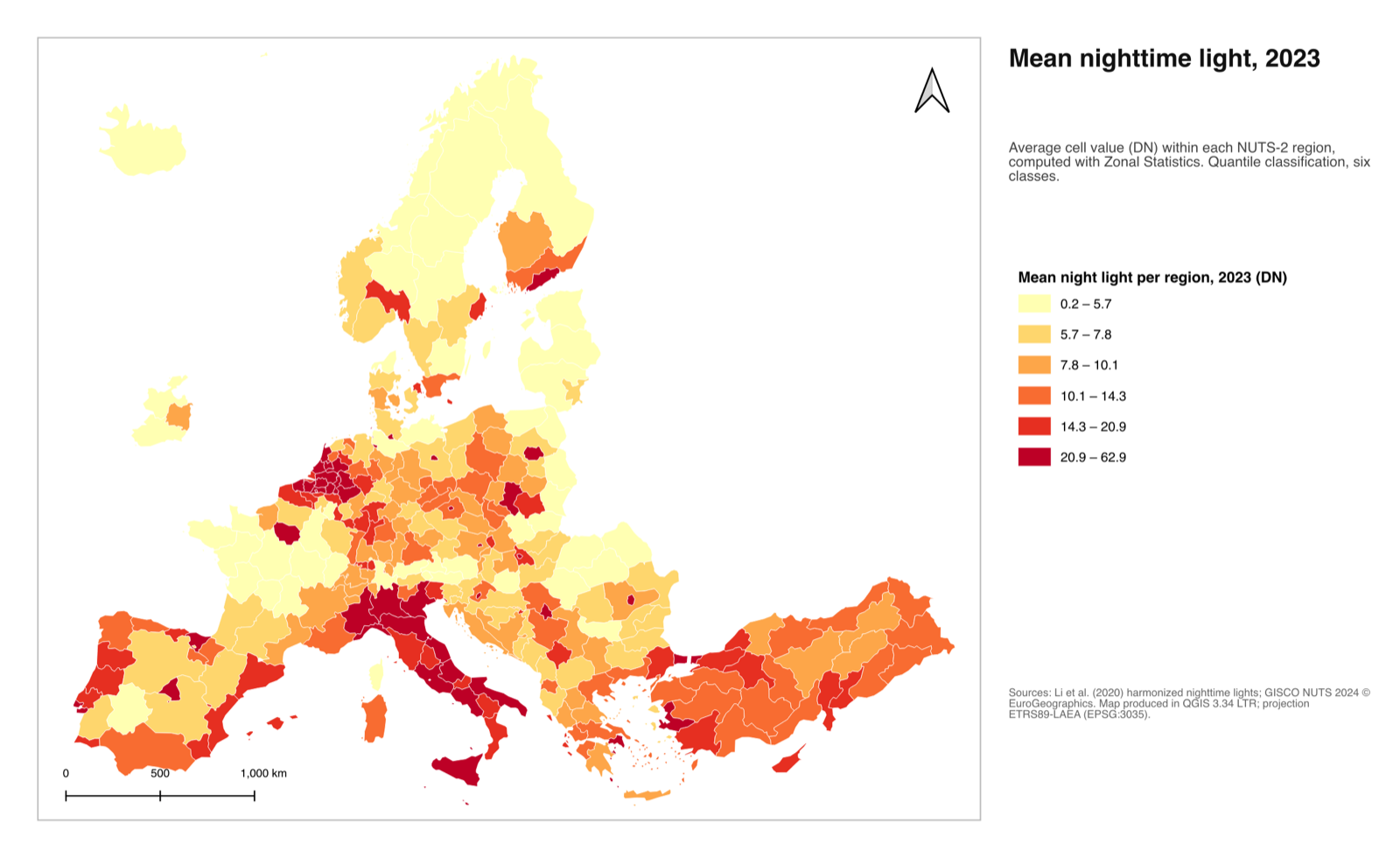
Which statistic? Count is the number of cells, a proxy for area. Sum is total light, which scales with the size of the region and is the natural counterpart of total GDP. Mean is light per cell, a measure of density, and the natural counterpart of GDP per unit of area, not per person.
Cell area is not constant in WGS 84. Both layers here are in EPSG:4326, so a “cell” is 30 × 30 arc-seconds everywhere, which is about 0.86 km² in Sicily and 0.45 km² in Lapland. The mean is unaffected, but the sum and the count are. If you plan to use sums as areas or totals, reproject the raster first with Raster ▸ Projections ▸ Warp (Reproject)… to EPSG:3035, then reproject the polygons the same way and run zonal statistics on the projected pair (Economic Growth and Comparative Development, n.d.).
Both layers must overlap in the same coordinates. Zonal statistics does not reproject on the fly. If a polygon layer in EPSG:3035 meets a raster in EPSG:4326, every region receives a null value. When that happens, check the CRS of both inputs.
Step 5: Export the table
- Right-click
nuts2_gdp_lights_2023and choose Export ▸ Save Features As…. - Format: Comma Separated Value [CSV]. File name:
outputs/nuts2_gdp_lights_2023.csv. Click OK (Figure 17).
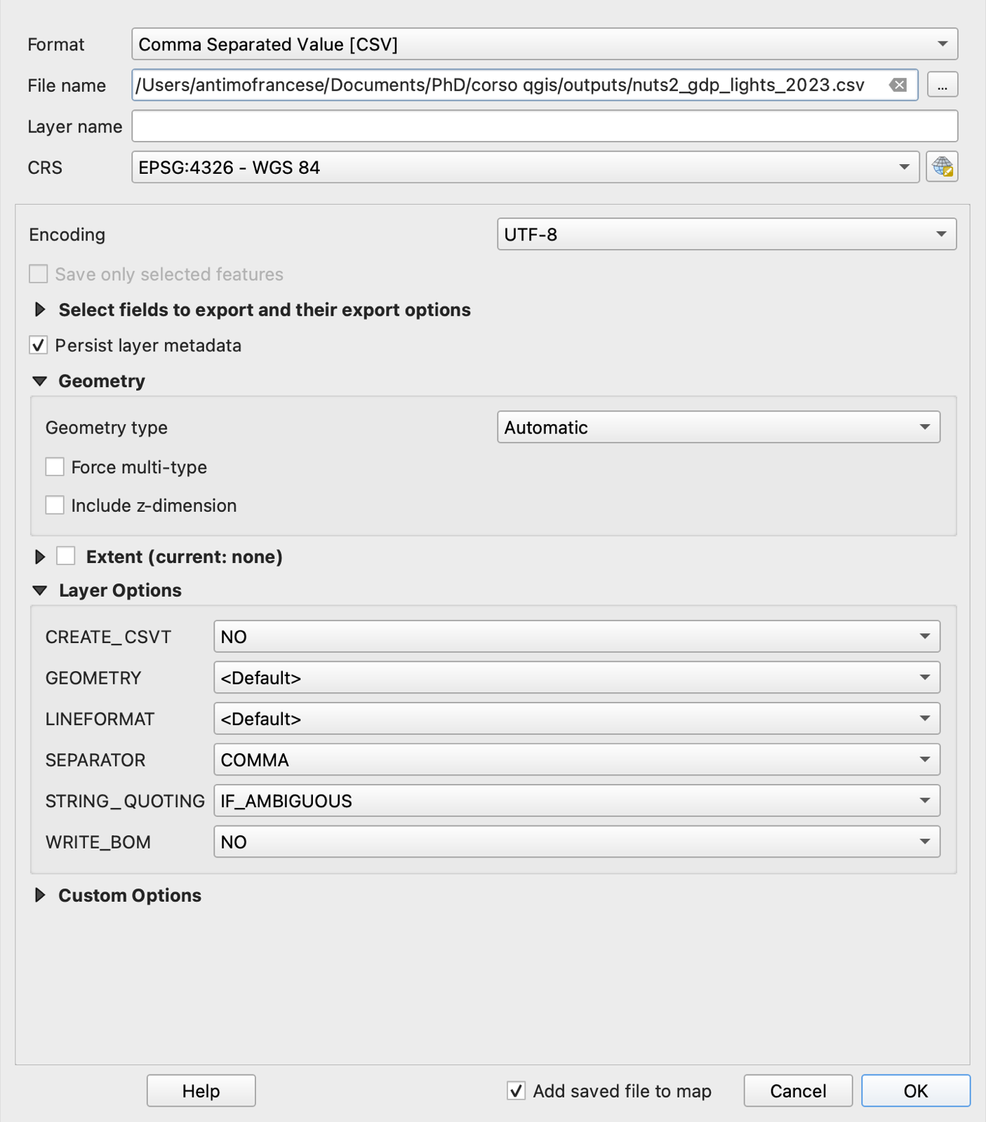
nuts2_gdp_lights_2023.csv: official GDP per capita and satellite-derived light statistics, side by side, for 299 regions.
| NUTS_ID | CNTR_CODE | NAME_LATN | gdp_pps_2023 | ntl_count | ntl_sum | ntl_mean |
|---|---|---|---|---|---|---|
| ITC4 | IT | Lombardia | 50,900 | 39,626 | 1,209,534 | 30.52 |
| ITF6 | IT | Calabria | 22,000 | 22,437 | 432,830 | 19.29 |
| DE21 | DE | Oberbayern | 66,600 | 30,322 | 309,679 | 10.21 |
| ES30 | ES | Comunidad de Madrid | 47,900 | 12,341 | 413,197 | 33.48 |
| RO32 | RO | Bucureşti-Ilfov | 69,400 | 2,759 | 108,923 | 39.48 |
| SE11 | SE | Stockholm | 57,800 | 17,980 | 364,818 | 20.29 |
| BG31 | BG | Severozapaden | 16,200 | 30,461 | 162,844 | 5.35 |
| FRY3 | FR | Guyane | 16,300 | 98,334 | 19,360 | 0.20 |
| CH01 | CH | Région lémanique | NULL | 14,688 | 139,579 | 9.50 |
What the numbers say
You now have, for 276 regions, an official measure of income and a satellite measure of activity. Plotting one against the other is the first thing to do with the exported file (in Stata, R, Excel, or the DataPlotly plugin inside QGIS).
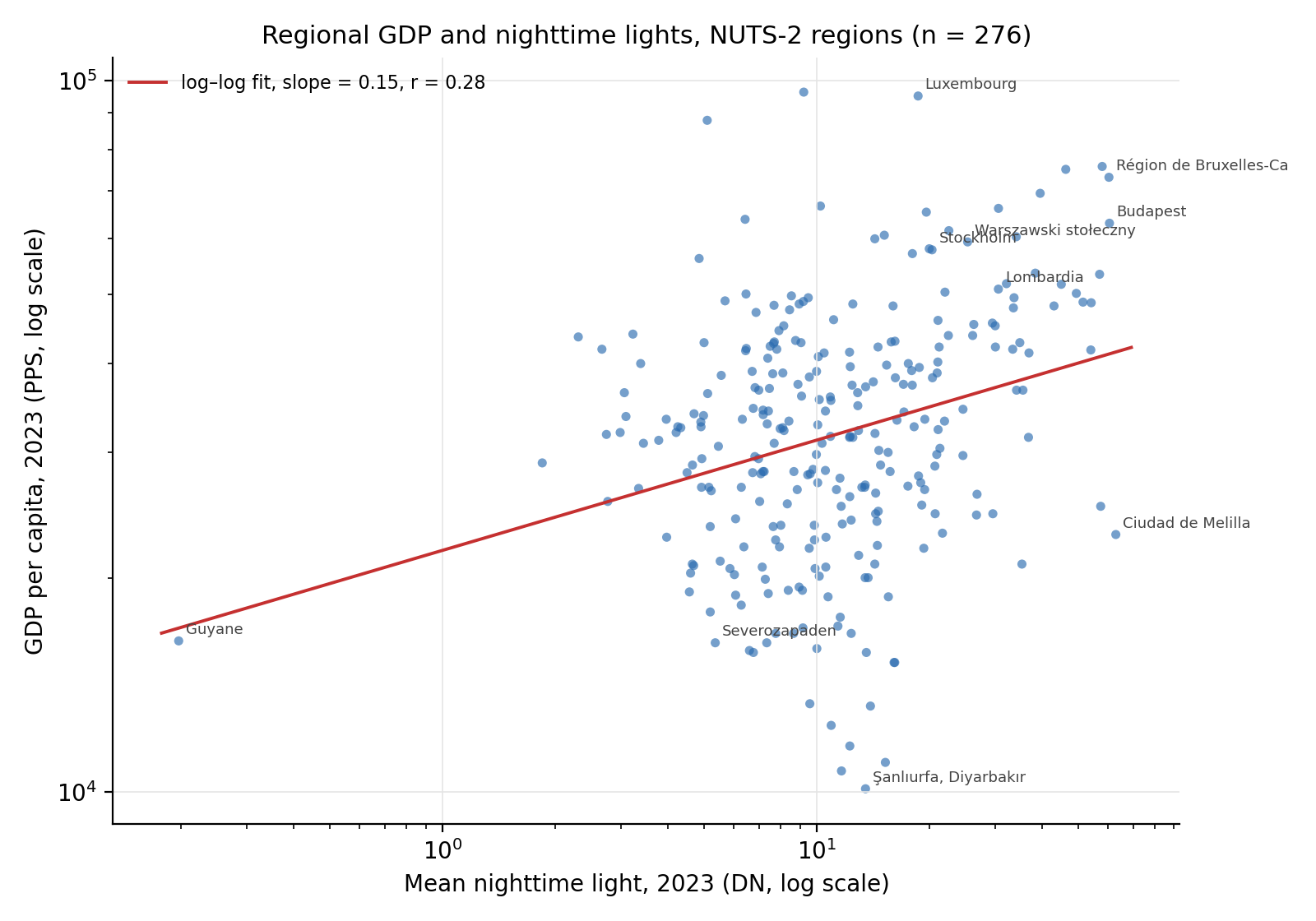
The relationship is positive but loose: the correlation of the logs is 0.28. That is lower than you might expect from the literature, and the reasons are instructive.
- Mean light is a density, not an income. It rises with population density and urbanization as much as with income per head. A rich but sparsely populated region (Oberbayern, with Munich and a lot of Alpine countryside) has a mean of 10; a poor but entirely urban region (Melilla) has a mean of 63.
- Saturation. At DN = 63 the sensor stops distinguishing; every large European city center is at the ceiling, so income differences among cities are invisible in the raster.
- Levels versus changes. Henderson et al. (2012) obtain their strongest results for growth, comparing changes in lights with changes in GDP within a country over time, which differences out fixed characteristics such as density and settlement structure. A single cross-section is the weakest test of the lights–GDP link.
If you repeat the exercise with total GDP (download the same Eurostat table with unit MIO_PPS_EU27_2020) and the sum of lights (ntl_sum), so that both variables measure the size of the regional economy, the correlation of the logs roughly doubles, to 0.55 in these data. Trying it is a good first exercise, and it illustrates something general: the analytical work does not end when QGIS produces a column; that is where it starts.
5 Where to go from here
The two tasks cover the operations that recur in most applied papers: join, style, lay out, clip, zonal statistics, export. A few natural next steps, all available through the QGIS menus.
| If you want to… | Use… |
|---|---|
| Measure distance from each region or point to something (a coast, a capital, a road) | Processing Toolbox ▸ Distance to nearest hub or Join attributes by nearest |
| Build a circle of a given radius around points (catchment areas, treatment zones) | Vector ▸ Geoprocessing Tools ▸ Buffer (in a projected CRS, so that the radius is in meters) |
| Attach the attributes of polygons to the points that fall inside them (which region is each firm in?) | Vector ▸ Data Management Tools ▸ Join Attributes by Location |
| Compute the area of each polygon, or a new variable from existing columns | The Field Calculator in the attribute table ($area, in a projected CRS) |
| Count events (conflicts, patents, plants) per region | Vector ▸ Analysis Tools ▸ Count Points in Polygon |
| Reduce polygons to points for distance calculations | Vector ▸ Geometry Tools ▸ Centroids |
| Add a background map for orientation | Browser panel ▸ XYZ Tiles ▸ OpenStreetMap |
| Put a scanned historical map into coordinates | Layer ▸ Georeferencer… (under the Raster menu in versions before 3.26) |
| Repeat a workflow on many files or many years | Processing ▸ Graphical Modeler, then PyQGIS or GeoPandas (Chiovelli and Hohmann 2020) |
And a short list of open data sources that economists use constantly.
| Data | What it is | Where |
|---|---|---|
| GADM | Administrative boundaries for every country, several levels | gadm.org |
| Natural Earth | Countries, populated places, rivers, coastlines, at cartographic scales; public domain | naturalearthdata.com |
| GISCO | NUTS and other European statistical units, matching Eurostat codes | Eurostat GISCO |
| VIIRS nighttime lights | Monthly and annual composites, 2012–present (free registration) | Earth Observation Group |
| GHSL | Global population and built-up area grids, 1975–2030 | Global Human Settlement Layer |
| WorldPop | Gridded population counts, ~100 m | worldpop.org |
| WorldClim | Temperature and precipitation grids | worldclim.org |
| Copernicus DEM / SRTM | Elevation, from which slope and ruggedness are derived | Copernicus · USGS EarthExplorer |
| ACLED | Georeferenced conflict events | acleddata.com |
| OpenStreetMap | Roads, buildings, land use, crowdsourced; loadable directly in QGIS with the QuickOSM plugin | openstreetmap.org |
6 Files used in this course
All the data are open. The repository that hosts this page contains copies of the small files and of everything QGIS produced, so that you can check your results against them.
| File | Description | Source and license |
|---|---|---|
data/nuts2_2024/ |
NUTS-2 boundaries, 2024 version, 1:20M, EPSG:4326 (shapefile: .shp, .shx, .dbf, .prj, .cpg) |
Eurostat/GISCO (Eurostat/GISCO 2024); administrative boundaries © EuroGeographics, free for non-commercial use with attribution |
data/eurostat_gdp_pps_nuts2_2023.csv |
GDP per inhabitant in PPS, NUTS-2, 2023 (nama_10r_2gdp, extracted September 2026) |
Eurostat (Eurostat 2026); CC BY 4.0 |
data/Harmonized_DN_NTL_2023_simVIIRS.tif |
Harmonized DMSP–VIIRS nighttime lights, 2023, 30 arc-seconds (31 MB; download from the source) | Li et al. (2025) via figshare; CC BY 4.0 |
outputs/nuts2_gdp_2023.gpkg · .csv |
Result of Task 1: boundaries with GDP per capita attached | Produced in this course |
outputs/nuts2_gdp_lights_2023.gpkg · .csv |
Result of Task 2: the same, plus count, sum, and mean of nighttime light per region | Produced in this course |
outputs/qgis_course_example.qgz |
A QGIS project with all layers styled as in the figures and the print layout of Figure 10. Place it in outputs/ next to a data/ folder containing the three source files, then open it. |
Produced in this course |
The figures were produced with the QGIS engine (version 3.34.13 LTR) from these files; the screenshots show QGIS 3.34 on macOS. The scatter plot in Figure 18 was drawn from the exported CSV.